Sketchin

The new face
of the Italian Wood and Furniture Supply Chain

We collaborated with FLA for the strategic rebranding of one of Italy's most historic industrial federations. Starting from a shared vision of the future, we equipped the organization with a consistent set of tools to tell the story of a complex Made in Italy supply chain with authority, clarity, and modern relevance.

Minimalist beige fabric sofa with a light wood base, ideal for modern interiors and Nordic living room design

We collaborated with FLA for the strategic rebranding of one of Italy's most historic industrial federations. Starting from a shared vision of the future, we equipped the organization with a consistent set of tools to tell the story of a complex Made in Italy supply chain with authority, clarity, and modern relevance.

Industry

Public Service & Institutions

Year

2025

Client

FederlegnoArredo

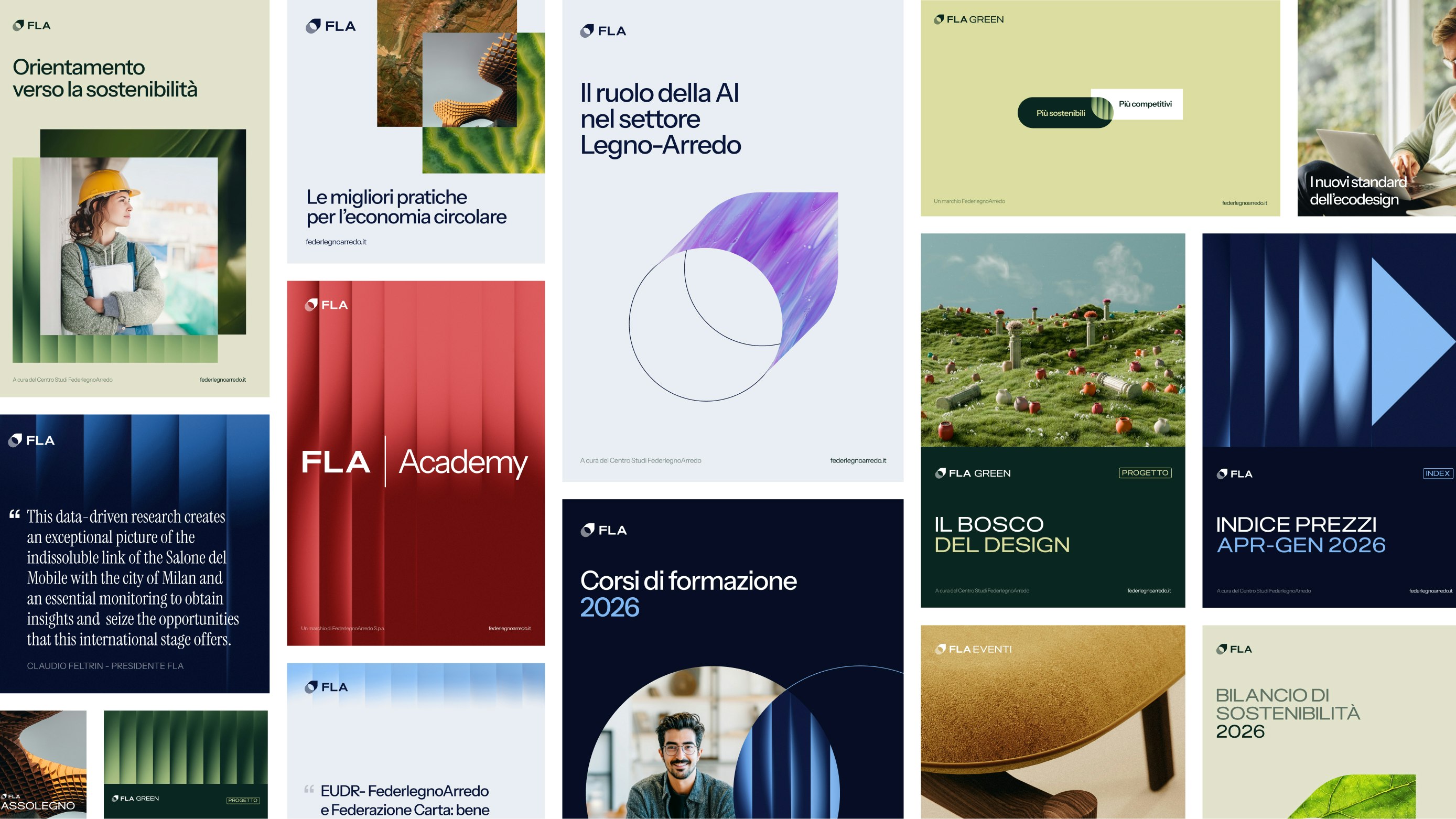
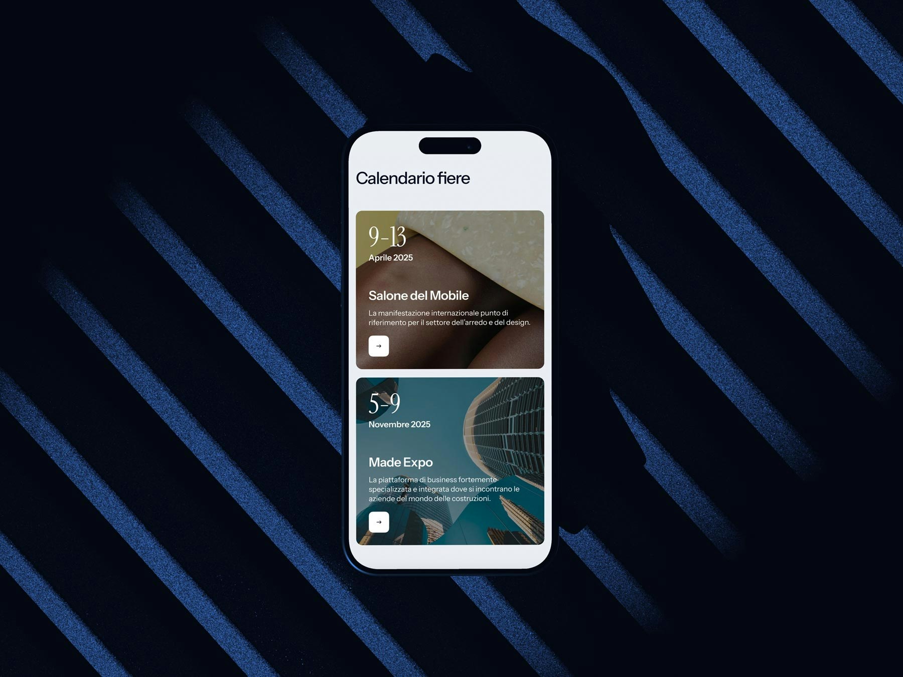
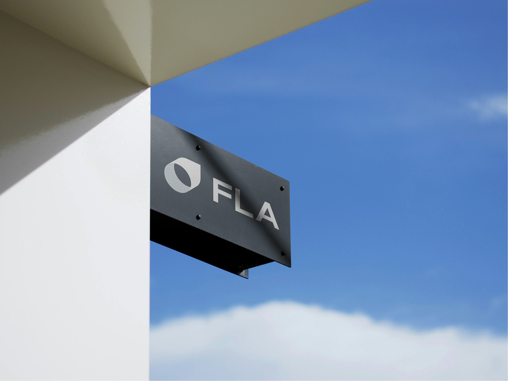
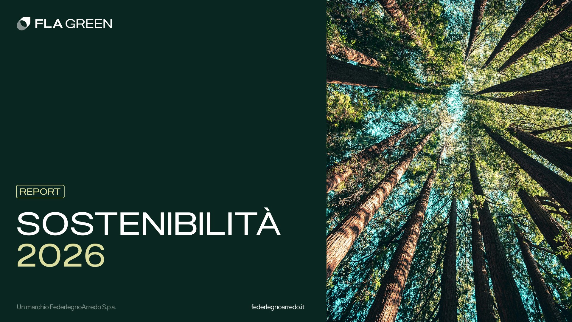
From a complex ecosystem to a consistent and scalable brand system

FederlegnoArredo is now the point of reference for more than 2,200 companies in the wood-furniture sector, promoting Italian living culture worldwide. Until now, its identity was fragmented, with differing visual and communication styles.
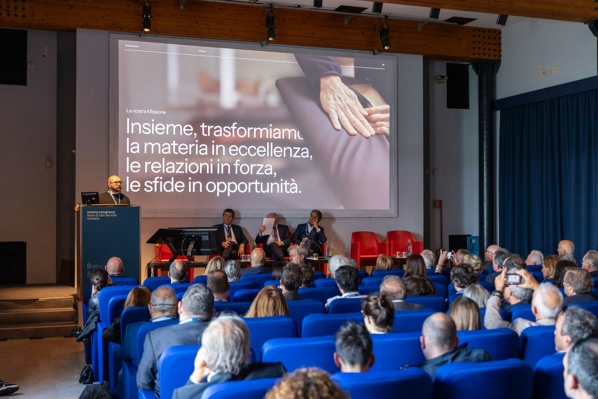
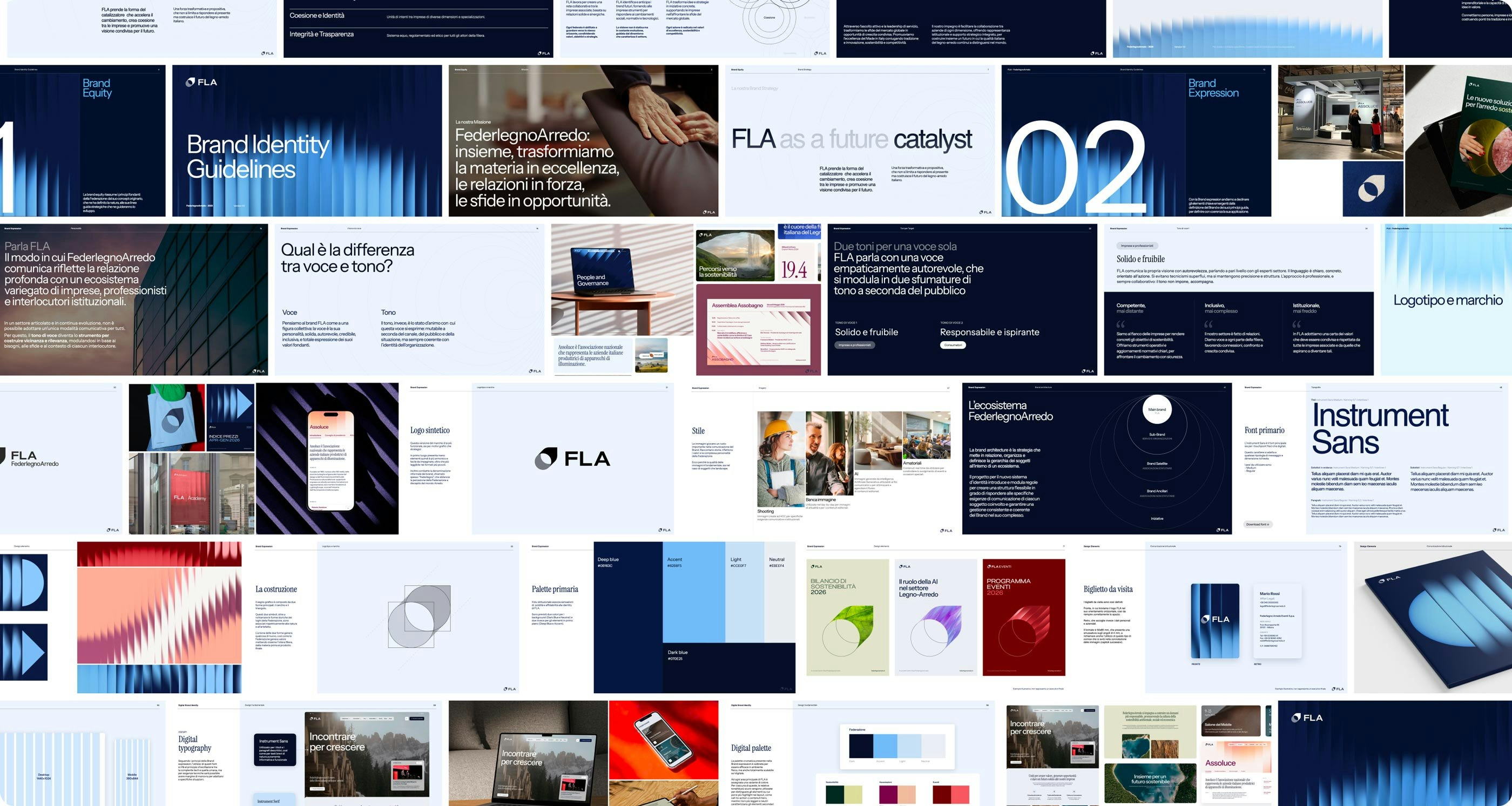
On the occasion of the Federation's 80th anniversary, we initiated a collaborative process to restore consistency, clarity, and recognizability to the entire ecosystem — turning complexity into structured richness and enhancing the collective strength of the system through a unique identity. Through the Brand Manual, we defined a structure of guidelines for strategic and expressive coherence across the ecosystem.

Outcome

The project not only created a new brand identity, but also built a complete system of operational tools to support FLA’s transformation.


  • Brand Architecture: A unified model clarifies the relationships between the federation, statutory and non-statutory associations, services, and initiatives.

  • Two-level Design System: A scalable system that combines a multichannel identity manual and a Figma design library, built for future integration with digital services.

  • Shared storytelling through co-design: The rebranding introduced a unifying concept — servant leadership — repositioning FLA as an enabling force in the supply chain.

  • Organizational alignment: The presentation at the 2025 National Assembly marked a shift in brand perception, opening up a new phase of internal engagement.

Brand equity: an identity that leads, a system that inspires

The foundation of the project is a profound redefinition of the Federation's positioning. FLA is no longer just a representative voice in the sector, but an entity capable of activating, accelerating, and leading change.
This vision introduces the principle of “FLA as a future catalyst”: an enabling force connecting companies, interpreting change signals, and steering the whole sector towards a sustainable, competitive future.

There are three pillars to this strategy:

  • Cohesion, understood as building a shared horizon among different subjects;
  • Vision, as the ability to anticipate trends and turn them into opportunities;
  • Action, as concrete support for businesses through shared tools, services, and initiatives.

Values like sustainability, transparency, excellence, and innovation are now expressed through a more inclusive, accessible, and contemporary narrative.

Craftsman working on a modern furniture component inside a wood-furniture sector factory, with clothes hanging in the background. The image conveys artisanal care, innovation, and the value of Made in Italy, aligned with the values of the FederlegnoArredo ecosystem.
Stack of freshly cut logs under a blue sky, depicting the raw material of the Italian wood-furniture sector.

The shared foundations of the new brand

The new FederlegnoArredo identity is the result of a journey built together. We actively involved the Federation’s stakeholders in a phase of shared exploration, through workshops, moments of dialogue, and collaborative generation activities.
This process made it possible to authentically bring out the soul of FLA, focusing on the most relevant values and collective aspirations. This provides a solid and shared foundation to build an identity that can represent the whole system with consistency, distinctiveness, and vision.

Sketchin is a valuable partner in FLA's strategic repositioning, they truly understand our needs, turn complexity into clarity, and amplify ideas through innovative design. Together, we are shaping a bold, new future for Italy's wood-furniture supply chain.

Andrea Meneghel | Marketing, Innovation and Sustainability Director @ FederlegnoArredo
FederlegnoArredo business conference, with a speaker presenting the 'FLA as a future catalyst' strategy to an audience of wood-furniture sector professionals.
Collaborative workshop with wood-furniture stakeholders seated around a table, as presenters share projects on large screens. The image conveys active participation, co-creation of strategies, and innovation within the FederlegnoArredo ecosystem.

Transformation as the foundation of the FLA brand

When rethinking the visual identity of FederlegnoArredo, we started from the principle that the brand should embody the Federation’s deeper mission: to be a driver of transformation for the entire wood-furniture sector.

This transformation isn’t only economic or productive, but also cultural, symbolic, and relational. It’s the ability to enhance the origin — the material, the wood — and guide it towards new shapes, meanings, and possibilities.

The logo is born from this tension between nature and design. The circle represents raw material, the trunk, the source of the process. The triangle symbolizes human intervention, design thinking, and creativity. Their intersection generates a new, vibrant, dynamic shape: the catalyst, FLA’s distinctive mark.

Not just a logo, but a visual system capable of telling the collective identity of an entire supply chain.

The visual identity was developed with a systemic approach. Institutional colors, organized into main and secondary palettes, allow every part of the ecosystem — associations to events — to have their own recognizable but consistent expression.

The typography, designed to balance solidity and readability, is paired with graphic elements that evoke structure, material, and collective creation. Textures, icons, and layouts are designed to be easily applied, digital-first, and able to adapt to different formats while maintaining a strong identity.

The result is a visual system that doesn’t impose, but organizes. A graphic language that holds together the FLA world and makes it legible, accessible, and creditable. A new identity that speaks to the present but is built to accompany change.

Smartphone mockup displaying 'Trade Fair Calendar' screen with Salone del Mobile and Made Expo 2025 events, on a dark background with blue waves. The image conveys digitalization, innovation, and trade fair organization in the wood-furniture sector.

A consistent brand architecture

We redesigned the entire brand architecture, defining a clear hierarchy among master brand, sub-brands, satellite brands, and initiatives.


The new system allows each subject to speak in its own voice while remaining part of a unified identity. FederlegnoArredo thus becomes the authoritative center of a consistent and scalable system.

Sub-brands like FLA Eventi, FLA Plus, or FLA Green maintain visual coherence with the master brand, while associations like Assarredo, Assoluce, or Assobagno express themselves according to defined yet flexible rules. Internal initiatives, such as FLA Academy, follow a simple and easily adaptable generative matrix.

A plural, consistent, and recognizable voice

Just as the visual identity brings unity to the ecosystem, FederlegnoArredo's tone of voice defines its new communication stance.
We developed a voice that can speak to all the Federation’s audiences — companies, institutions, citizens, bodies — adapting intelligently to context while maintaining consistency in values.

This is a competent, yet never overly technical voice, able to be understood without oversimplifying. It is inclusive, representing a system made up of both small and large, public and private, territorial and international realities. It is a responsible voice, able to describe today’s complexity with honesty, concreteness, and vision.

The tone of voice thus becomes a strategic tool to build trust, strengthen reputation, and make FLA recognizable even in how it connects with the world.

Mosaic of FederlegnoArredo brand guidelines and materials, including graphics, texts, and digital mockups.

A digital experience that connects and guides

The FederlegnoArredo web portal is the main point of access and connection between the Federation and its audiences: member companies, institutional entities, media, international stakeholders and training operators.

Designing the digital experience first and foremost meant shaping this plurality, with an interface capable of guiding, informing and engaging in a simple and consistent way. We built a modular logic that allows the richness of the FLA system — from associations to special projects — to stand out, while always maintaining identity unity.

The visual identity translates into a consistent experience that fully lives in the digital space without sacrificing its complexity. We designed a system of dynamic templates for the main sections of the portal — news, events, documents, services, member area — capable of adapting to different content while maintaining visual and functional consistency.

To support the entire digital ecosystem, a scalable UI Kit was developed: a set of reusable components that ensures continuity in user experience and simplifies the work of internal teams and vendors. The kit includes interface elements, palettes, typefaces, patterns, layout systems, and icons consistent with the brand identity.
The new digital ecosystem is designed to evolve, grow with the system, and support change over time.

Smartphone showing Salone del Mobile and Made Expo events on a vivid red background
Tablet on a wooden table with FederlegnoArredo content about environmental, social, and economic sustainability.

With a new clear identity, shared language, and scalable system of tools, FederlegnoArredo now stands out as an evolved benchmark for the Italian wood-furniture sector. The project has strengthened the Federation’s ability to represent, involve, and lead a broad and complex ecosystem more coherently, accessibly, and authoritatively. By working deeply on vision, structure, and design, we made FLA’s transformative potential visible and actionable: now a reality that not only narrates the present, but also builds the future of Italian living.

Project numbers

iterations
13
stakeholders involved
50+
sub-brands impacted
18

Get in touch

Learn more about our projects and what we can do for your business.